This summer series will highlight weekly blog posts from this year’s UW Data Science for Social Good Fellows.
“Machine learning can improve disaster response after hurricanes, but not alone” by Tessa Schneider, 2018 Data Science for Social Good Fellow
As fellows on the Disaster Damage Detection team (D-cubed) at the eScience Institute during the Data Science for Social Good (DSSG) summer fellowship, we are facing challenges that serve as learning opportunities we can carry with us in our professional lives. In the words of Tim Peters, author of The Zen of Python, “errors should never pass silently”. We in the D-cubed team are learning collectively while managing complex lines of Python code, resolving software incompatibility issues and dealing with large imagery data. Emergency managers also face challenges preparing for hurricane events. They’re learning lessons on how to further improve decision-making and coordination of the many actors involved in disaster response efforts from hurricanes Harvey, Maria and Irma. According to Datafloq, these three hurricanes alone impacted upwards of 26.5 million people in the US in 2017, so improving disaster response after hurricanes would have a far-reaching effect.
Using annotated satellite imagery from Hurricane Harvey, D-cubed is working with the Disaster Data Science Lab (DDS) to train a machine learning algorithm to automatically detect flooded buildings among other features after hurricanes. The process involves preparing a set of training data consisting of satellite images from after Hurricane Harvey with annotated boxes around flooded buildings and flooded roads. Using the object detection method, this is fed to the algorithm so that it learns what those features look like and can later predict whether a feature in a satellite image is in fact a flooded building or flooded road with an acceptable level of certainty. DDS Lab director, Dr. Youngjun Choe, estimates that this model could reduce the time for damage assessment to 24 hours or less depending on the imagery availability and the amount of processing power that is applied. This tool could save emergency managers weeks that windshield surveys (systematic observations recorded from a moving vehicle) often require to complete damage assessment; however, disaster response is exceedingly complex and there are many factors to consider.
We spoke with emergency managers at the Seattle Office of Emergency Management (SOEM) to gain further insight into what they require of technological tools to assess damages and optimize disaster response. As SOEM Planning Coordinator, Luke Meyers, and Technology Coordinator, T.J. McDonald, brought up, there are some regional limitations to relying on satellite imagery for damage assessment. Areas with a marine layer of cloud coverage could mean that satellite imagery is only available days or even weeks after the event, as was the case during the 2006 and 2009 Seattle floods. This tool must be considered one of many available to emergency managers. Another area of research could be in developing a similar model that uses aerial imagery that could be obtained using UAV’s.
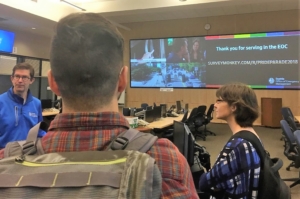
In addition to gaining insight from stakeholders like emergency managers, there is usually another researcher out there who can serve as a sounding board. One such researcher, Tony Cannistra, whose insights helped D-cubed to direct our project is working on detecting snow cover to measure the impacts of climate change on mountain ecosystems.
Despite the growing availability of open source programming languages like R and Python, together with the endless support of StackOverflow and generous contributors to GitHub, some advances in technology are not so accessible to DSSG fellows and the masses. Machines have been learning from incorrect weather predictions to adjust weather forecasting models since the 1970’s, according to QUARTZ. With advances in computing power in recent years, these early models became more accessible. (In fact, non-profits and researchers can receive thousands of dollars’ worth of cloud computing credits through Microsoft Azure, Google Cloud and AWS Cloud.) Models developed by IBM’s The Weather Company are 30% better at predicting hurricane intensity than traditional models. The Monte Carlo tree search algorithm allows the model to predict multiple scenarios including directional movement, changes in intensity and duration of time in an area. The Weather Company can also predict power outages to alert utility companies prior to an event. The problem, though, is that this technology is still only for private use and not yet purchased by the US government, whose models predict 5-10 days behind those of The Weather Company.
Technological advancements in the form of earlier hurricane prediction and quicker damage detection alone are not enough to improve disaster response and humanitarian relief efforts. Multi-sector coordination is required to effectively implement the available resources, including said technology. One Federal Emergency Management Agency (FEMA) initiative during the Obama administration, the “Whole Community” approach, actively involves civil society and the private sector in disaster preparedness, while also improving coordination between these entities. As reported by The Conversation, one success of this approach was observed during the Hurricane Harvey response when store owners, such as grocer H.E.B., helped distribute food and supplies to the affected region.
After Hurricane Katrina, FEMA was granted the authority to move resources for disaster response, which would enable quicker response time after extreme weather events. Before Hurricane Harvey, this took the form of meals, water and tents pre-positioned just outside of the flood zone, which were distributed by state, local and tribal officials. This was much more effective during Hurricane Harvey than during Hurricane Maria, when, as CNN reported, thousands of shipping containers full of relief supplies at San Juan port of Puerto Rico could not be distributed due to limitations in ground mobility. During Hurricane Harvey, volunteer relief pilots were able to deliver supplies, medicine and evacuees.
Achieving comprehensive disaster preparedness goes beyond policies changing FEMA’s authority before disaster events. The costs of hurricanes are not evenly distributed. Inequality matters. According to Brookings, low income and minority communities are more vulnerable to natural disaster risks and face more difficulty recovering. The infrastructure in low-income communities and affordable housing units of lower quality make them more susceptible to damage. These neighborhoods or buildings are often nearer to industrial facilities where toxic chemicals could leak after a hurricane. Low-income families are less likely to have insurance policies. Just 17% of homeowners had flood insurance in the eight most strongly affected counties after Hurricane Harvey. National Flood Insurance Policies (NFIP) average $500 per year in Texas, with those living within the floodplain being charged $2000 annually, reported the Washington Post.
As D-cubed team fellows we are not only learning by applying machine learning methodologies, but also through conversations with emergency managers to gain insight on the challenges they face. While it’s clear that machine learning models for automated damage assessment using satellite imagery would make damage assessment quicker and optimize the disaster response efforts of emergency managers, it cannot be considered a cure-all. This tool can be considered one of several available to improve the difficulties emergency managers face in comprehensive disaster response. Additionally, disaster response should not just rest with emergency managers, but civil society and the private sector should have significant involvement, as well, as part of a “whole community approach”. This could help fill the gap in justice for individuals in low-income or minority neighborhoods who are disproportionately affected by disaster events immediately and years afterwards; at least until more systemic justice is realized. This would ensure that the speedier disaster response efforts that would result from an automatic damage detection model are not just benefitting the most privileged.
————
“Putting perspective into practice” by Amandalynne Paullada, 2018 Data Science for Social Good Fellow
One of the things I am enjoying most about being a DSSG student fellow is the opportunity to apply my technical skills to an area outside of my academic research while integrating knowledge from my lived experiences. As a student fellow on the Seattle Mobility Index Project, I have been able to draw upon my perspective as someone who lives and travels in Seattle as we build tools to analyze data toward an understanding of access to transportation in our city.
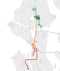
Pretend you are me for a minute. You’re an able-bodied graduate student in her twenties. You don’t own a car; you generally use a bicycle to get around. You live in Ravenna, just north of the University District. It’s about half-past 11 p.m. on a weeknight, and you’ve just landed at SeaTac. Thankfully, the light rail is still running at this hour; in the past, when your flight has landed later than the light rail runs, you’ve had to wait 20 minutes for a $40 Lyft ride home, a non-trivial surprise expense for a graduate student. You get to the University District around 12:30 a.m. You could wait another half hour for the next bus home, or you could walk home in that amount of time; but you’re exhausted and you have a class at 8:30 in the morning, so you decide to call a Lyft – you can spare $10 for the convenience. While you’re waiting for the Lyft to arrive, a much older man approaches you and verbally harasses you. No one else is around. You’re grateful when your ride arrives a few minutes later.
After another late night arrival at SeaTac, you’re on the light rail north again when it terminates service at Beacon Hill. You don’t know how to get home from here and it’s nearly 1 a.m., so you decide to take a Lyft the rest of the way. A visibly exasperated young woman who was also on the train asks you if you know how to get to the number five bus stop; her phone is dead and her charger is broken. You’re nowhere near the five bus stop, so you offer the girl a spot in the Lyft you’re taking north. You find out that the girl is a high school student whose drill team practice in Des Moines ran late. You can’t picture leaving her to wait for a bus downtown all alone this late at night, so you offer to pay for the Lyft to take her the rest of the way home to Shoreline.
From anecdotes like these, we can begin to build a picture of where the gaps are in our transportation system. For the data scientist, several interesting questions arise: how can we connect the experiences of individuals to meaningful metrics that can inform policy decisions? How can we operationalize concepts related to the experience of transportation such that they can be visualized, quantified, and acted upon? And finally, how can we define and understand mobility using not just words, but principled, reproducible methods?
One way of framing access to transit is to compare supply and demand for transportation in different neighborhoods. University of Texas professor Junfeng Jiao defines “transit deserts” as areas where demand for transit exceeds supply. For example, Seattle’s Rainier Valley, home of the Ethiopian Community center, has seen its historic residents displaced to neighborhoods flung far across the city, having to slog through multiple bus transfers taking hours to travel to and from the center. For car-free commuters in Rainier Valley, there is a dearth of transportation options that meet their needs.
Of course, comparing transportation supply and demand is just one way of examining mobility. In our work on the Seattle Mobility Index, our team has taken a multi-pronged approach, defining mobility with respect to affordability, mode availability, and reliability. Intuitively, these concepts make sense as part of an understanding of transportation equity, but in order to make any quantitative sense of them, we need to give these terms rigorous definitions and devise methods of calculation to quantify them.
Something that I am currently working on with my teammate Rebeca de Buen Kalman is developing metrics for mode availability. It is a challenge to decide how to operationalize this concept such that it can be translated to code. Our team defines mode availability with respect to the possibility of arriving to a desired destination within a reasonable amount of time choosing between four modes of transportation: biking, walking, driving, or public transit. For example, is a traveler able to get to their nearest library by bike in under 45 minutes? By bus in under an hour? On foot in 30 minutes? These time thresholds can vary based on personal information about a traveler – are they mobility impaired? – and information about the time of day – perhaps a 30 minute walk in the day time is preferable to one at night. There is no “right” answer for how to translate abstract concepts like mode availability to practical, concrete calculations, and that is one of the unique challenges of our project.
As we synthesize and analyze information, we want to ensure our models are intuitive and understandable. When individuals are able to connect our data to personal experiences from their own lives, we can count that as a success.
————
“<Data science for decision-making, data science through decision-making>” by Woosub Shin, 2018 Data Science for Social Good Fellow
With four weeks to go, we are working hard to analyze our data and develop mobility scores (I am a proud member of the Seattle Mobility Index Project team). I started thinking about this idea while doing biostatistics research at the University of Michigan, but recently I became more convinced: data science is not just about helping decision-making of others, but it is an active process of decision-making.
Why do we do data science? One answer is that we want to understand the world using the data we have, because data are the reflection of reality. In this sense, data science is the study of data, which helps us better understand reality through principled ways. In today’s society, data are everywhere, and their potential to reveal the world we live in is nearly infinite. However, there is a more practical reason of why data science can make society better – data help us make decisions. For example, pharmaceutical companies have to determine if their new drug will cure disease more effectively. Marketing firms want to decide where to advertise products in order to attract more customers. In our DSSG project, stakeholders want to understand people’s travel patterns and preferences to make better policy decisions to improve Seattle’s transportation system. Data enable us to make better decisions by offering valuable insights.
But this is not the only place that data science is associated with decision-making. There is another dimension, which is data science through decision-making. Many academic researchers would agree that research is about making decisions, from designing experiments and making assumptions, to interpreting the results and presenting them to an audience. Data science is no different. In our DSSG project, when we selected the travel records in Seattle, we had to determine if we should include trips whose origins and destinations are outside the city. If one person traveled from Bellevue to downtown Seattle, is this a trip in Seattle? If we said yes, we would include a lot more trips by driving (there are not many buses coming to and from Bellevue). Another case was when we were choosing the market basket of destinations; we had to determine if we should include hospitals in the basket, as people’s first choice hospitals seemed to be inconsistent. On the other hand, trips to hospitals may give us valuable information on the population of certain areas; we eventually decided to include some of them.
These kinds of questions cannot be properly answered with technical knowledge alone. They also need a lot of domain knowledge and insights, and many times, deep understanding of the context and the goal of the project. ‘What we want to know’ is truly important in data science. In our DSSG project, our team learned from stakeholders that they were interested in understanding people’s behaviors, so we are currently trying to reflect this in our mobility scores. For example, we are constructing ‘personas’ that include people’s mode preference and travel patterns, and we will incorporate this with mobility scores in the coming weeks.
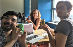
This interaction between the goal (decision that we want to make eventually) and data science process (decision-making as we do data science) fascinates me. I would cautiously argue that being aware of this process will help produce effective results, and one may need to become a proficient decision-maker in order to become a great data scientist. For sure, we do not have to think about this (oh yes, I’m making decisions!) all the time, but it will help us remain consistent in our technical work, and consistency –though it doesn’t sound very fascinating – is an important quality in any impactful work.
I hope, in the future, data scientists will take more active roles in setting agendas, or asking questions, and participate in high-level decision-making rather than passively responding to others. I appreciate that the DSSG program focuses on ethics in data science, as it is an important but easily ignored aspect in this active process. Anyways, this is a topic for the future, and for now I need another La Croix before thinking about it too hard (see picture, above). 🙂

