This summer series will highlight weekly blog posts from this year’s UW Data Science for Social Good Fellows.
“Getting ground truth data through geospatial analysis” by Sean Chen, 2018 Data Science for Social Good (DSSG) Fellow
Introduction
It’s a much bandied about statistic, but it’s an important one: more than half of humanity’s 7 billion and counting people live in cities. While the United States is still more suburban than urban, DSSGers need only look around our summer home of Seattle to see how many of America’s cities are burgeoning and booming, with both good and bad consequences. While we may get to enjoy the charms of Capitol Hill or the amazing development boom of South Lake Union after a day of work at DSSG, we are also confronted by some of those side effects: homelessness, gentrification, economic and social disparity.
Along with these developments, there is an increasingly large flow of data about cities becoming available. Sensors in the environment measuring air pollution, cameras measuring traffic flow, transit cards measuring taps on and off public transport, geotagged social media posts, higher resolution satellite and aerial images, so on and so forth. Along with these data come many possibilities for using it for social good.
More traditional needs such as transportation planning have much to gain. Whereas older models for predicting traffic and transit demand patterns were rough estimates, transport planners have more accurate data from smart cards which record taps on buses and taps on and off trains. When the city can get its hands on it (which is not an easy task), data from Transportation Network Companies (TNCs) like Uber and Lyft can also be incredibly helpful in understanding where and when people need and want to get around.
It’s not just the physical infrastructure that is affected. Data can also help a city make better social, public health, and environmental policy decisions. For instance, air quality sensors can help people better understand patterns of pollution, letting planners know where it would be most beneficial to plant trees that can help block and absorb airborne particles. Data can also help public health officials detect patterns of disease, such as a pattern of asthma that’s been correlated to the pollution the air quality sensors have detected.
Data’s ability to help us better predict how people behave and how the city will behave can help city planners to make better planning decisions. It can help city government officials better serve their citizens and make the city a better place to live.
Data Science & Geospatial Analysis
The key to this new revolution of using data to improve our cities lies in geospatial analysis. What is geospatial analysis? Quite simply it is a technique of trying to understand geography. Most human activity takes place in physical space; even our cyberspace activities have a physical space presence when they’re geotagged! Because we as a species inhabit geographic space, understanding our relationship to this space can help us better understand ourselves and better adapt to our environs.
Data science lends itself perfectly for geospatial analysis. Machine learning has long been a part of geospatial analysis. A classic example is land use and cover classification. How do we know what areas are used for residential use or for agricultural use? A quick way is to take aerial imagery – either from planes or satellites – and use machine learning classification to understand patterns of pixel values in rasters. My project here at DSSG is trying to take that a step further; we are attempting to use computer vision and deep learning to teach a machine to be able to automatically know what buildings and places are damaged after a natural disaster – such as a hurricane – using aerial or satellite imagery. This would be invaluable to emergency service providers and disaster response planners trying to triage the aftermath of an event and attend to those most in need. While we are using deep learning to help do this type of object detection, we need to start with a ground truth to teach the machine. This is where geospatial analysis and geospatial data science comes into play for us; the ground truth data by definition is geospatial.
To create this ground truth data for our deep learning algorithm, my team has used all sorts of data science tools specifically tailored for geospatial datasets. Many of us are using Python to do our geospatial analysis. One of the most basic and important tools is GeoPandas, a geographic extension of the wildly popular Pandas. What this does is essentially add a geometry column to our Pandas dataframe, letting each geometry be related to other non-spatial variables. GeoPandas behind the scenes relies on the libraries Shapely and Fiona to create these geometries and the regular, old Pandas to store and manipulate variables attached to those geometries.
In Python, one can also rely on OGR and GDAL. These libraries are not actually built in Python. Rather, they are built in the more powerful and lower level C language with wrappers for Python and other languages available. You can also use command line tools with these libraries. We’ve relied heavily on these command line tools to reproject, mosaic, tile, and even compress image files.
We are also using more traditional GIS tools. GIS stands for geographic information systems. They help us visualize and analyze geographic data. The most prevalent software is ESRI ArcGIS. It is considered the standard, professional software used by anyone working in fields relating to geospatial analysis. However, ArcGIS costs money – a lot of money. As such, at DSSG, we are using the open source QGIS. What’s wonderful about QGIS is that it brings together many different existing toolsets – GDAL, GRASS, SAGA, and more. You can also write your own Python scripts using PyQGIS to help automate processes. In fact, there’s a large community of developers that create Python plugins just for QGIS. (Though if anyone wants to run such a script, they will need QGIS as the Python kernel is specifically for QGIS.)
Finally, because we have so much data and because that data takes a long time to process, we’ve created a PostGIS database – a geospatial extension of the popular and open source PostgreSQL database. This has allowed us to centralize a repository of our data using a cloud server (allowing us to share the data easily) as well as more easily apply geospatial processes on that data. Running something in the cloud means my little machine doesn’t have to strain under such a workload (and means I can still surf the net without something crashing!). (Another blog post by Chris Haberland goes into more detail about PostGIS and its benefits.)
While we’ve been trying to create a ground truth, other teams have been trying to understand geography and its spatial patterns. There are many statistical techniques for doing such. For instance, how can we tell if the distribution of certain variables across space is random or non random? Is the racial spatial distribution of people and resources in our city random or non random? That is, have we seen any patterns of segregation? This is definitely something we want to know if we want to create a more equitable city! An easy to use tool is Moran’s I. When calculated, this number can give us an estimate of how random that variable’s distribution across space is, whether or not it has a pattern or not. We can also use a geographically weighted linear regression, helping us to understand the relationship between spatially distributed variables and outcomes. We know that these interactions may behave differently in different areas, so this tool lets regression coefficients vary by geographic area. GIS software like ArcGIS has many of these tools built in. But we can also use the Python library PySAL to help implement these types of analyses. If R is more your speed, there are plenty of existing packages as well.
Conclusion
Geospatial analysis has long been used heavily by commercial interests. The classic example is logistics: shipping and transportation companies need to figure out the best routes (e.g. the Traveling Salesman Problem). But retail also uses it to figure out the best place for store locations.. Even inside your local mall, retail is looking at where you go and how long you linger there (sometimes even tracking your phone’s Bluetooth). And don’t forget things like Pokemon Go!
But geospatial analysis doesn’t have to be just about commercial interests. It can be about social good. Whether that be tracking the flow of refugees, figuring out the best public transit routes, or even teaching a machine how to help emergency service providers identify and locate areas damaged by natural disasters. That’s what we hope to accomplish with our project.
This is a very light overview of the relationship between data science, geospatial analysis, and social good. It is a burgeoning and exciting new area of study. New techniques and new tools will definitely become available over time, making it important to stay up to date. But its uses to help make our cities and places better for everyone are priceless.
————
“Is garbage in always garbage out? by Andrew Escay, 2018 Data Science for Social Good Fellow
People who have been interested in any form of data science work have often heard these two sayings: 1) you will spend more time cleaning your data than running analysis on it; and 2) garbage in, garbage out. In any data science project, clean data is almost always a prerequisite for accurate outcomes. There are several reasons for this: 1) our analysis can impact real lives on the ground if we’re working with community-facing information and we don’t want to make biased conclusions; 2) many complex analyses hold certain assumptions that must be true in order for the conclusions to be true as well; and more generally 3) you can’t draw conclusions from data that does not accurately reflect what you are analyzing.
More specifically, in supervised machine learning, “ground truth” – data which is deemed to be objectively true – is the prerequisite before running any complex algorithms. This is because you are essentially telling a machine what is right and wrong, and asking it to figure out how to reach those conclusions on its own. It’s this type of data cleaning which I will focus on here. The current practice in supervised machine learning is to have people manually go through the data set that will be used to train an algorithm and filter out any messiness in the data to create what is known as “clean data” or “ground truth”.
Luckily for data scientists, many companies, industries and organizations are starting to recognize the exponentially increasing impact that data has on our lives, and are thus starting to make the necessary adjustments to support modern data infrastructures that will improve the cleanliness of data. However, this change is met with some challenges. First, many small and medium-size enterprises and organizations who wish to adopt modern data practices are constrained. They lack the funds necessary to support that infrastructure and the number of skilled professionals necessary to undertake such a massive data migration task. Second,there is still a huge amount of data that remains messy no matter how much effort you put in to try to organize it. Examples of this are: written feedback sent to companies by their customers which have no common structure and could be muddled with language errors; inventory systems that are automated but still require manual inputs, exposing them to human error; and satellite imagery that can never be devoid of some amount of cloud cover, which may obscure key details and reduce the accuracy of images.
Why isn’t this mess going away?
As you can imagine, these types of messy data can still be generated despite your best efforts in trying to keep your database clean. They also happen to be some of the hardest data to validate, detect, and effectively clean in an automated manner – because that data would definitely not be there if it were easy to clean. The problem of satellite imagery with messy cloud cover is what I worked on over the summer at the University of Washington eScience Institute Data Science for Social Good program. Our Disaster Damage Detection team is working with this imagery to build an algorithm that can annotate damages after a hurricane to help inform first responders and emergency personnel on the ground. Cloudy images are something you always have to deal with if you’re trying to generate timely images after a storm hits. It’s also very unlikely that all countries have access to expensive satellite imagery with 8 remote sensing bands, which in some cases can peer through the clouds and provide visibility. To put it bluntly, the mess is inevitable.
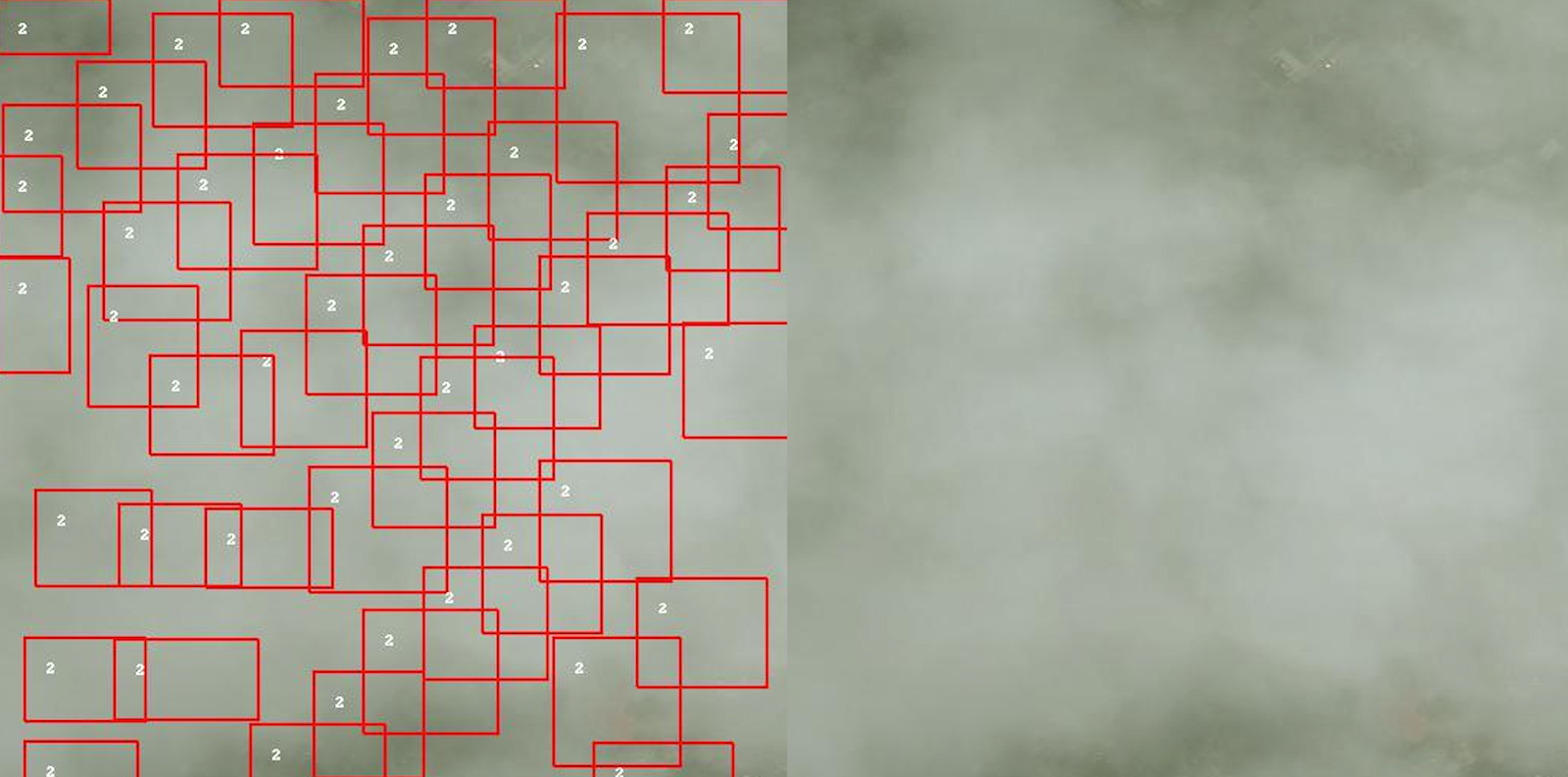
Figure A shows us an example of this inevitable mess. The red boxes in the left image show buildings in the area using a data set of building footprints, but the satellite cannot detect them because it lacks the visibility to see beneath the clouds.
Thought Experiment – Can we perfectly clean all our data?
In such messy data context, I pose the question: do all forms of data actually have the ability to become “clean”? Join me as we engage in a quick thought experiment .
Let’s think of a way to try cleaning a data set with 50,000 images and a couple hundred building structures inside each image. This is not exactly how our data set was, but some features are shared. Imagine each image has a mix of cloud cover and volunteer-sourced points that indicate if a building is damaged.
There are a few things to note:
1) some buildings are incorrectly tagged when volunteers sort the images
2) some images have weirdly angled shots that make buildings look somewhat distorted
3) it is generally hard to see if there’s actual damage in the image.
Now let’s try to clean it!
In the context of a few hundred points, maybe even a couple of thousand, manually inspecting and filtering out parts of the image covered by clouds can be reasonable, though difficult. However, when you start to talk about tens of thousands of points, it can get cumbersome to manually go through it all. But for the sake of this thought experiment let’s say we can do it.
Even in the most ideal situation, where you can get a team to clean all those points, the chances that you are able to replicate this process are slim, because not everyone can source that many volunteers to filter the data. But again, let’s assume that constraint doesn’t exist.
Even if you can get enough people to look at all of the images, the likelihood for human error comes back into play. It seems as though you will never be able to clean that data. Now let’s say you can clean it without human error, how does your model react with messy data? Are you going to start overfitting your model to work only with your data set or another perfectly cleaned data set? This is likely to be the case in a supervised machine learning process because the machine can only learn what you are going to train it with.
One method for confronting this issue is “data augmentation” which is the act of adding slight variations to the data you use to train your model in order to make it more robust, such as changing the size, color, or orientation. However, this injects some level of variation – or framed differently, mess – back into the data set. Although this statement may draw criticism, I know there is a difference between the variation you generate with augmentation and the mess of bad data. Variability in data augmentation keeps features relatively the same, you just want the computer to account for some difference in how that correct data is presented, whereas messy data is wrong information that muddles up the good information. However, there are examples where data augmentation creates more problems for the algorithm, such as when it is biased to your choice of transformations which may not be realistic. Or on the flip side, the augmentation you generate might not be that different from data that are considered to be “messy”.
I do know that not all data problems have this inevitable mess problem, but this is where I want to draw some attention: don’t we want to be able to build algorithms robust enough to deal with a wide array of variation in our data, regardless of how it’s formed?
What do we do with our landfills of data?
The amount of data we generate year after year is exponentially increasing; we hear and see this all the time when we see posts that compare the data generated on the internet now to those of the times of Shakespeare and the like. And the majority of the data we’re generating nowadays is also user-generated data; posts, messages, pictures, all with their own faults, misspellings, and quirks. Thus it seems like we are essentially creating landfills of data according to our current standards of clean data. This is why I want to challenge myself and others to think of ways we can build data science algorithms and tools which can be robust to the mess we see in our data today.

I do believe that cleaning should still be done in the long run, but I think there is a point in time when it takes too much effort to clean data for a very marginal amount of gain. I’d like to demonstrate this with a simple example visualized right (Figure B). The image on the left displays the type of “messy” data we used to train the algorithm. The blue boxes here represent a damaged/flooded building, and the orange boxes represent buildings that were not damaged. The data we used to train this algorithm on was not entirely correct in flagging what was flooded or not. However, despite having some wrong labels, the computer was still able to make general conclusions about which buildings were flooded in the images on the right.
This is an isolated example where we saw this behavior but we do not know yet whether the algorithm performs this way with all other cases. However, it does give us some hope that maybe it is possible to have models that can deal with this sort of messy data.
I’ll close this off with two points which we can continue to ponder on, and hopefully learn the answers to:
1) can we build algorithms that can sift through some level of messy data and still learn effectively?; and
2) can we make it more acceptable to work with a degree of messy data, under the assumption that you flag the bias in your model, and be very explicit about what impact this may have?